Conversion-Boosting Homepage Design Tips for E-commerce Stores
Your homepage is your storefront—and in e-commerce, it’s often your first and only chance to make a strong impression. In just a few seconds, visitors decide whether they’ll stay, explore, and eventually buy—or bounce. That’s why effective homepage optimisation is essential to any online store’s success.
Great homepage design goes beyond aesthetics. It’s a balance of intuitive layout, clear messaging, trust-building elements, and strategic navigation—all working together to increase conversion rate and turn casual visitors into loyal customers.
In this post, we’ll explore proven e-commerce UX design tactics for high-performing homepages and offer actionable tips to create a welcoming and conversion-focused experience from the moment someone lands on your site.
Why Your Homepage Matters More Than Ever
Your homepage often serves multiple roles:
- It introduces your brand identity and voice
- It showcases your bestsellers, offers, and categories
- It sets the tone for trust, usability, and visual appeal
- It functions as a launchpad for deeper site exploration
Whether users arrive via ads, search engines, or social media, your homepage is a critical first conversion opportunity. A well-optimised homepage doesn’t just impress—it guides and converts.
Key Principles of Homepage Optimization
Before diving into specific features, it’s important to understand the foundational principles that drive homepage optimisation:
1. Clarity Above All
Visitors should immediately understand who you are, what you sell, and what action they should take next.
2. Visual Hierarchy
Design should guide the eye naturally from most important to least important elements—usually following a top-to-bottom, left-to-right flow.
3. Consistency
Use consistent branding, colours, fonts, and messaging across all sections to build trust and recognition.
4. User-Centric Design
The homepage should reflect your audience’s needs, not just your business goals. Focus on what’s useful, intuitive, and persuasive to them.
Conversion-Boosting Homepage Features
Now let’s get into the actionable stuff. These are the must-have features that contribute to a homepage that converts.
1. A Clear, Benefit-Driven Hero Section
Your hero section (the top part of your homepage) is prime real estate. It should include:
- A bold headline that communicates your value proposition
- A supporting subheading that clarifies what you offer
- A high-quality visual (product image, lifestyle shot, or video)
- A strong, visible CTA (e.g. “Shop Now,” “View Collection”)
E-commerce UX design tip: Make sure this section is clean, uncluttered, and mobile-optimised. It should speak to your target customer’s desires within seconds.
2. Highlight Bestsellers or New Arrivals
Customers often land on your homepage unsure of where to start. A curated display of popular or new products:
- Provides social proof
- Shortens decision-making time
- Encourages browsing
Use a visually consistent grid layout, with hover effects and clear CTAs like “Quick View” or “Add to Cart.”
3. Display Trust Signals Prominently
Building trust is essential to increase conversion rate, especially for new visitors.
Include:
- Customer reviews or star ratings
- “As seen on” media features
- Secure payment badges
- Easy return and shipping info
- Trustpilot or Google Reviews integrations
Place these strategically near the hero or product section to reinforce credibility early on.

4. Use Navigation That Guides, Not Distracts
Homepage navigation should strike a balance between clarity and depth. Avoid overwhelming visitors with too many choices.
Best practices include:
- A sticky, simplified top menu (e.g. Shop, About, Contact)
- Dropdown menus for categories
- A search bar with auto-suggestions
- Mobile-friendly hamburger menu with touch-friendly buttons
Bonus tip: Include a “What’s New” or “Gifts” category to encourage exploration.
5. Showcase Your Brand’s Story or Mission
Today’s consumers care about who they’re buying from—not just what they’re buying. Dedicate a section to your story or purpose:
- What drives your brand?
- What makes your products unique?
- What values do you stand for?
Pair this with behind-the-scenes visuals, founder images, or customer lifestyle shots.
6. Incorporate Exit-Intent Offers or Popups (Sparingly)
Used thoughtfully, popups can recapture attention without ruining the user experience. Try:
- A discount code in exchange for email sign-up
- A time-sensitive promotion
- A quiz or product matcher to personalise the journey
E-commerce UX design warning: Avoid aggressive, instant popups. Delay by at least 10 seconds or use exit-intent triggers to keep the experience smooth.

7. Optimise for Mobile Users
More than half of e-commerce traffic comes from mobile devices. A homepage that looks great on desktop but clunky on mobile can hurt your conversions fast.
Mobile tips:
- Use responsive design that adapts to screen size
- Make buttons and CTAs large enough to tap easily
- Use short, scannable text
- Keep images compressed but high-resolution
Test your site on multiple devices regularly.
8. Use Colour and Contrast to Guide Attention
Effective use of colour can draw attention to your most important elements, such as CTAs or key announcements.
Tips:
- Use one primary CTA colour and repeat it consistently
- Maintain high contrast between background and text
- Use whitespace to separate content blocks and avoid visual overload
9. Speed and Performance Matter
No matter how beautiful your homepage is, if it takes more than 3 seconds to load, many users will bounce.
To improve load time:
- Optimise images
- Minify CSS and JavaScript
- Use caching tools and a fast web host
- Avoid autoplay video or heavy animations
Fast-loading sites convert better. Period.
10. Analyse and Improve Continuously
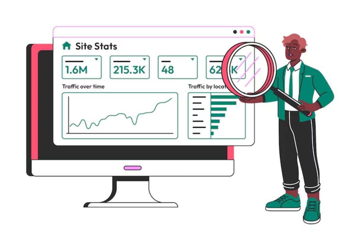
Great homepage design isn’t static. Use analytics tools like Google Analytics, Hotjar, or Clarity to:
- Track where users click and scroll
- Measure bounce and exit rates
- A/B test hero images, headlines, or CTAs
- Identify bottlenecks in the user flow
Your homepage should evolve based on user behaviour—not just trends.
Homepage Optimization Checklist
Quick recap of elements that should appear on a high-converting homepage:
- Clear headline and CTA in the hero section
- Bestsellers or new arrivals carousel
- Visible trust signals and social proof
- Simple, mobile-friendly navigation
- Brand story or mission snapshot
- Email capture or incentive popup
- Optimised for mobile UX
- Strong use of colour, whitespace, and contrast
- Fast loading speed
- Regular testing and data-driven updates
Final Thoughts: Guide, Don’t Overwhelm
Your homepage isn’t a place to show everything—it’s where you show the right things. Smart homepage optimisation means giving visitors just enough information to spark interest, build trust, and drive them deeper into the shopping journey.
Whether you’re launching a new e-commerce brand or refining an existing site, these e-commerce UX design principles will help you craft a homepage that does more than just look good—it will actively increase conversion rate and set your store apart in a crowded marketplace.


